Data Visualization using Microsoft Power BI

INTRODUCTION
To create these dashboards, a range of technical skills is required, particularly in the ETL (Extract, Transform, Load) process. Extraction involves importing data from various sources, such as live data streams, SQL Azure Data Studio, CSV files, and Excel, into Power BI Query Editor. Transformation includes data cleaning tasks like removing errors, handling duplicates and nulls, transposing tables, and performing operations such as joining and appending tables. After creating fact and dimension tables, the data is loaded into Power BI for analysis. At this stage, I conducted data modeling, which included defining relationships, creating measures using DAX (Data Analysis Expressions), building hierarchies, and establishing a date table for time-based analysis. In the visualization pane, I designed and customized visuals tailored to the data type and analysis requirements, ensuring the dashboard provides clear and actionable insights.
PROJECT 1. Defining Marketing Strategy based on COVID19 Data - Power BI
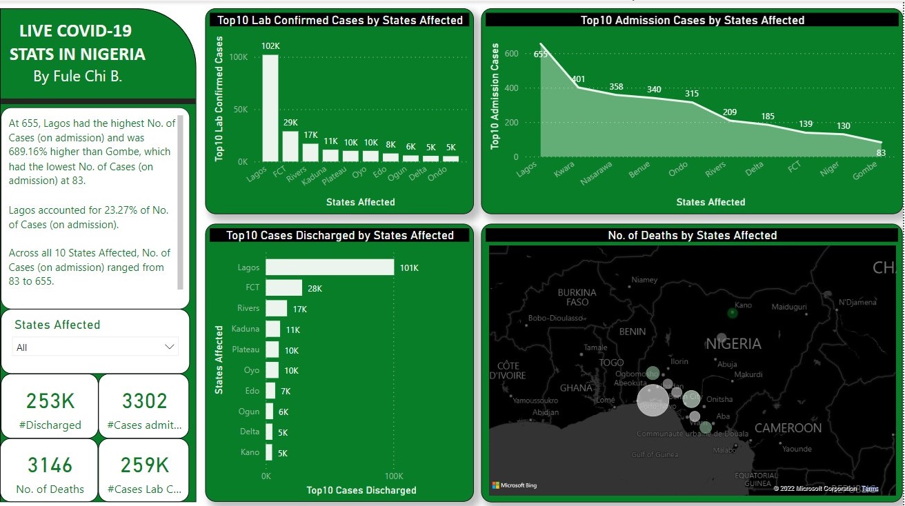
Due to health concerns for their staff, the top managemenet of a company which has branches spread in several states in Nigeria is looking for real time information on COVID 19 that will inform them on the best business strategies to consider in a bid to minimize loss. To achieve this, real time data was obtained from http://covid19.ncdc.gov.ng/ and loaded into Power BI. A report was created using visuals like maps, graphs, charts and sliders. Among the 37 states observed, a quarter million cases of COVID 19 was registered and over 3000 deaths, predominantly in Lagos, FCT and Rivers States. I recommended that stricter sanitary measures be observed at the branch offices in these cities.
 Click here to access the PowerBI file: https://github.com/FuleChi/Power-BI/blob/main/COVID19%20Nigeria.pbix
PROJECT 2. Visualizing Financials of A Company
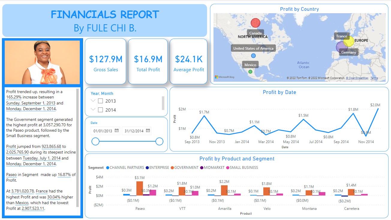
This project highlights key performance metrics, showing gross sales of $127.9M, total profit of $16.9M, and an average profit of $24.1K. A notable profit increase of 165.29% occurred between September 2013 and December 2014, with the Government segment contributing the highest profit of $3M for the Paseo product. Profit growth was particularly strong from July to December 2014, where it jumped from $923K to $2M.
Profit trends, represented by a line graph, reveal significant spikes in November 2013, May 2014, and November 2014. On a geographical scale, France contributed the highest profit, 30.04% higher than Mexico, which had the lowest. Product-wise, Paseo and Amarilla performed well across segments, especially within the Government sector, driving overall profitability.
 Access the PowerBI file here: https://github.com/FuleChi/Power-BI/blob/main/Coca-cola%20Sales.pbix
PROJECT 3. Visualizing Premier League 2021/2022
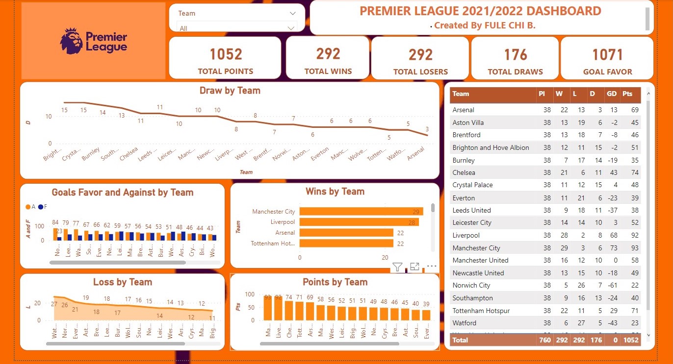
This project provides a detailed overview of the 2021/2022 Premier League season. The total points accumulated across all teams was 1052, with 292 wins, 292 losses, 176 draws, and 1071 goals scored. Teams such as Brighton and Crystal Palace led in the number of draws, with 15 and 14 draws respectively, while teams like Arsenal and Watford had fewer draws. The dashboard also highlights goals for and against each team, with additional insights into wins, losses, and points per team, providing a clear picture of the league's overall performance.
 The PowerBI file is accessible here:
  Access the PowerBI file here: